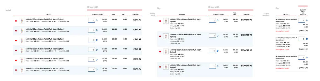
The mobile pages are too long
In agency work, client meetings are interesting.
Generally clients aren’t wrong (however there are exceptions). They know their business better than you, and they are much more invested in the outcome.
The challenge as a designer is not only to produce an excellent product that meets the commercial goals, technical limitations, budgetary requirements and user experiences required— but also to explain how the solution fits the compromise of the above.
After weeks/months of internal process and iteration it can often be taken for granted that everyone is aware of the reasons for design decisions. Here is a simple example.
Mobile pages are often longer, and for good reason. Content that takes 5 lines in a 700px wide column could take 10 lines in a 290px wide column on an iPhone SE— even after reducing the font-size.
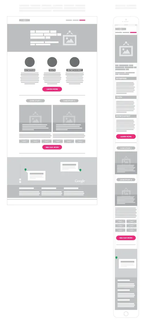
An example
I’m going to try and not make blanket statements… but:
If the prioritisation of content is carefully considered, an information scent is included and access to anything truly important is available without further interaction on page load, then reducing all margin-bottoms to 0 on mobile to try and decrease the page length is probably going to decrease usability rather than improve it.
In my experience scrolling is much more pleasant and natural on a mobile, and I think the use of whitespace was restrained.
But the constant feedback in client meetings when presenting flat visuals of designs was “The mobile pages are too long”.
Something needed to change.
At University one of my lecturers was an incredible calligrapher and typography expert— one of the old guard.
She refused to accept digital submissions of any work designed for print. A huge inconvenience at the time (costs + effort) but she was right.
“Its impossible to evaluate the work if it is not in the intended context.” — Ruth Dineen
Clients were viewing designs created for mobiles on desktop browsers, making it impossible to see the intended context.
It was possible that the pages were actually too long, but I wanted to test the hypothesis that their issue with the length was caused by the context.

Too long, or out of context? (Or maybe both)
Resources (and common sense) dictated we couldn’t create a visual for every possible client device, and experience from clients testing prototypes has shown that the majority would only check on their work PC even if instructed to do otherwise.
“If a problem can’t be solved within the frame it was conceived, the solution lies in reframing the problem.” — Brian McGreevy
Rather than cause inconvenience to users and actively blocking them from viewing on a desktop, I decided to try and meet the users on their terms, and provide the additional context they are missing.
Rather than trying to nest images within images and deal with an overflow hell-hole, a pure html/css seemed a simple choice. Lightweight, easily customisable and flexible. Thankfully the great people over at Marvel app had done a lot of the heavy lifting already with Devices.css.
Simply by nesting the full length image within the structure of the device provided a much closer experience to that of a mobile user— with the full length of the page hidden, only revealed in digestible chunks as the user chooses to scroll.
But while here, it seemed appropriate to see if there were other improvements to be made for clients, myself and the team.
Existing visual presentation process
The old process ‘worked’.
As far as I can tell it had been in use since 2003 (this is not a typo) with a small update to use <frame>, <frameset> and <noframes> elements in 2005.
It was simple process:
- Transfer graphics into a folder on the visuals server
- Create html files which reference a single graphic each
- Create a html file for the navigation/image selector
- Access visuals via a secure URL
But in projects with 10+ visuals, with multiple iterations and combined with some other internal issues would be pretty labour intensive for the designer.
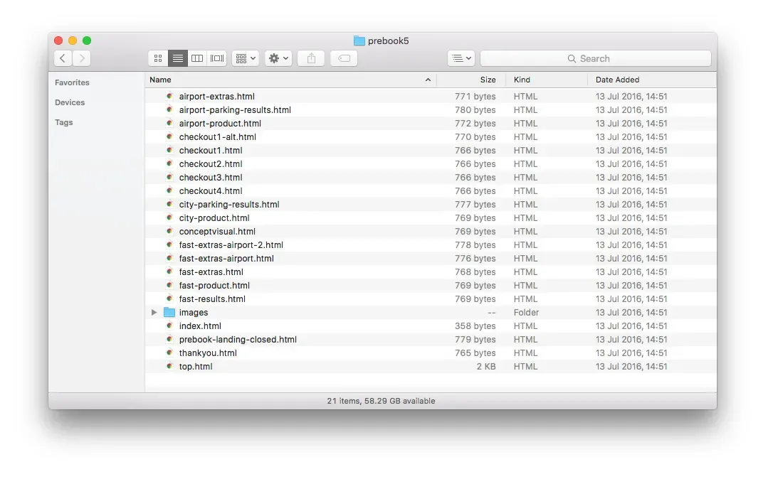
All files that need updating…
Initially my plan was just to incorporate our Devices.css markup into each of the html files that would be showing a mobile view. But what if we could automate the creation of these html files? (or achieve the same effect)
Short story
The agency I work for uses a custom CMS built in php.
I have no idea what php is.
Developers give me blank looks when I try and explain my ideas.
Or worse just say no.
How can I create and communicate my ideas effectively with the developers if we don’t speak the same ‘language’?
Time to learn what PHP is, how it works and how the developers will be using it.
PTL for Codecademy. 🙏
Hello PHP
Using my newly acquired php understanding I built a simple array that could hold a title, path to file and if it should display within the device frame
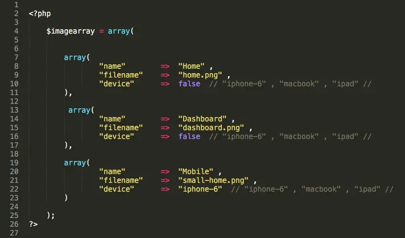
My simple array
By having only 1 file to update and maintain instead of 10+ I’d saved myself about 15mins every time (multiple times a day).
A few tweaks later included easy switches to toggle visibility and group visuals into sections and it was all looking good.
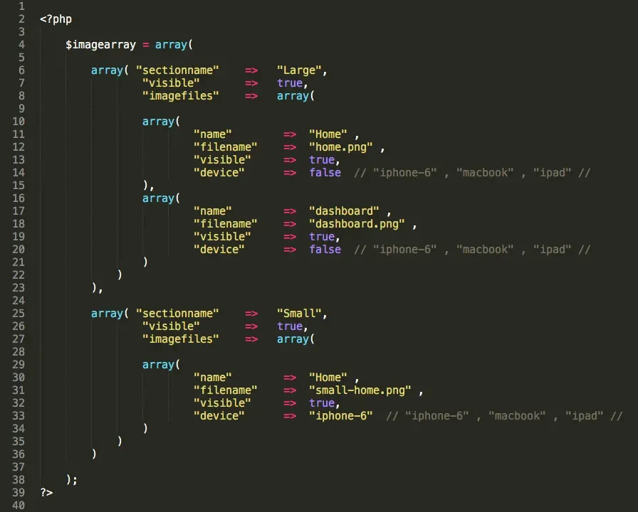
Additional tweaks
nav.html was updated to nav.php to enable an automatic generation of the navigation <frame> based on the visibility of in the image array, resulting in only one file to maintain per project!

:)
Introducing JavaScript
<frames> were removed from the spec in HTML5 “because using them damages usability and accessibility”.
I needed a quick way of replicating the functionality while remaining on one page (to prevent having to update multiple files, or learning how to create a database).
Its hacky, and my implementation does not improve the usability and accessibility failings of frames, but it doesn’t make them worse either.
Rebuilding this now if given infinite time and resources, this would be a great candidate for a framework like Angular, React or Vue to manipulate the DOM and use components for the devices. Accessibility and usability issues could start to be addressed by incorporating something into the URL to enable link sharing of particular visuals and to allow predictable use of the browser back and forward buttons.
After breaking the process down into some logical steps I was able to write some JavaScript with the help of jQuery that would:
- Prevent my links from navigating away to the image file
- Collect the path of the graphic to display
- A switch to check if it needed to insert the HTML/CSS phone around the graphic
- Display the graphic
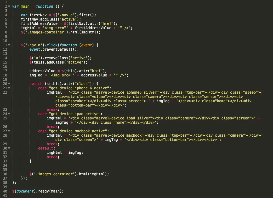
A little bit hacky, but gets it done 🙈
A few extra tweaks to toggle an active class in the nav to let users know where they were and to load the first image in the list by default and it was ready for testing.
Final result

Final result
Not one single comment of page too long since
Further reading
Here are some extra little things combining development languages I’ve taught myself and some design ideas.
Originally posted on Medium